Responsive Design
Some great soul has said “One picture is worth a thousand words”, and Digihive Web Design’s creations speak for our clients.
Responsive website is the advance development to mobile version. Almost every website owner looks for mobile version of their website. It is essential also because market flourish with different electronic gadgets and different screen resolution. With so many screen sizes, different browsers, and browsers it becomes challenging for the designer. Therefore, all best and latest websites are made with the approach in which both design and development responds as per the user behavior. Meaning the same website will open appropriately with any distortion at all different devices. That is, responsive websites are free from screen size, platform, and orientation.
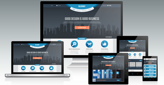
Any website which is not responsive is an old technology website and is not at all user friendly. The responsive website is essential for maximum online visibility. Responsive websites are made on the technology which automatically respond as per the user need. Irrespective of which device the user is laptop, mobile, tablet, I pad or personal computer, the website will open appropriately on all devices.
All are new designed websites are 100% responsive. We here also do redesign of the website. To know more in detail about the responsive website you can send us an enquiry below and our team will contact you at the earliest.